The problem of how to visualize multivariate data sets is something I often face in my work. When using numerical optimization we might have a single objective function and multiple design variables that can be represented by columnar data in the form {x1, x2, x3, … xn, y} a.k.a. NXY. With design spaces of more than a few dimensions it is difficult to visualize them in order to estimate the relationship between each independent variable and the objective, or perform a sensitivity study.
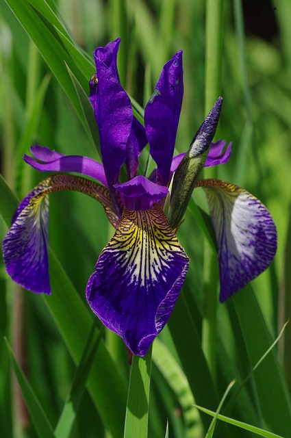
While perusing recent work in and tools for visualizing such data I stumbled across some nice examples of multivariate data plotting using Fisher’s Iris data set. This famous set contains data from 50 flowers, each of three different species, that were collected in the Gaspé Peninsula. This set is not in the NXY form typical of optimization routines, but instead each flower has a number of parameters measured and tabulated; namely sepal length, sepal width, petal length and petal width. In other words there is no resultant Y data that is a function of the design space vector. Instead, it is interesting to plot relationships between the measured parameters to determine if they correlate with each other.
A quick internet search brings up a number of examples where the set has been plotted as a gridded set of subplots, using various software tools. For example, Mike Bostock’s blog post demonstrating his D3.js package, and the version on the wikipedia page.
I decided to try and code a Matplotlib script to generate a similar gridded multiplot from the data set. I did so within a Jupyter Notebook (formerly known as iPython Notebook) running Python 2.7. The data was imported using Pandas and made use of Matplotlib’s Pyplot module. Pandas was used to import the data but it could have been done in a number of different ways; it is just that Pandas is designed to work with csv files containing a mix of types.
The resulting image can be seen below.
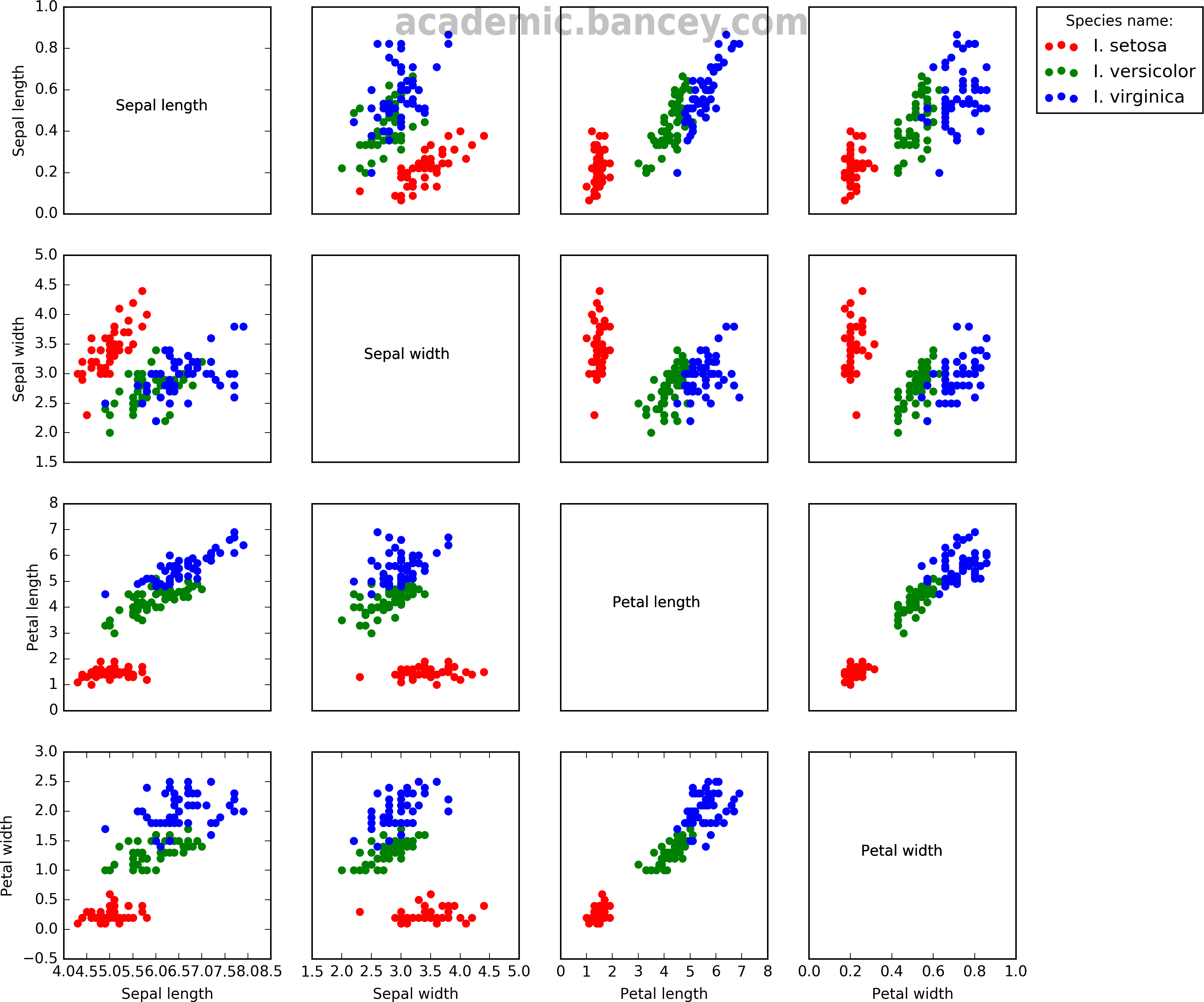 Figure: Fisher’s Iris data set sometimes known as Anderson’s Iris data set, visualization by Simon Bance using Matplotlib/Pyplot. A multivariate data set introduced by Ronald Fisher in 1936 from data collected by Edgar Anderson on Iris flowers in the Gaspé Peninsula.
Here is the script:
"""
https://en.wikipedia.org/wiki/Iris_flower_data_set
A script for plotting multivariate tabular data as gridded scatter plots.
"""
import os
import pandas as pd
import matplotlib.pyplot as plt

inFile = r'iris.dat'

# Check if data file exists:
if not os.path.exists(inFile): sys.exit("File %s does not exist" % inFile)

rootFolder = os.path.dirname(os.path.abspath(inFile))

# Read in the data file
df = pd.read_csv(inFile, delimiter="\t")
headers = list(df.columns.values)
df.head(5) # Prints first n lines to check if we loaded the data file as expected.

# We also have n=4 distinct species in the Species column and I will
# list the species names so we can distinguish them later for plotting:
species = list(df.Species.unique()) # normal python list, thank you very much!
print type(species)

# Here we specify how many columns prepend and append the columns that we want to use.
# For Dakota this would include the objective function(s) column(s) appended to the end.
num_precols = 0
num_obj_fn = 1

# Work out the number of dimensions in each design vector:
num_dims = df.shape[1] - num_obj_fn # We know that there are 3 additional columns (and hope that it stays consistent in future)!
print "Our design vector has %s dimensions: %s" % (num_dims, headers[num_precols:-1])
gridshape = (num_dims, num_dims)
num_plots = num_dims**2
print "Our multivariate grid will therefore be of shape", gridshape, "with a total of", num_plots, "plots"

# Plot the data in a grid of subplots.
fig = plt.figure(figsize=(12, 12))

# Iterate over the correct number of plots.
n = 1

# Create an empty 2D list to store created axes. This alows us to edit them somehow.
axes = [[False for i in range(num_dims)] for j in range(num_dims)]

for j in range(num_dims):
for i in range(num_dims):

# e.g. plt.subplot(nx, ny, plotnumber)
ax = fig.add_subplot(num_dims, num_dims, n) # Plot numbering in this case starts from 1 not zero (MATLAB style indexing)!

# Choose your list of colours
colors = ['red', 'green', 'blue']

for index, s in enumerate(species):

# x axis: For each in the species list look at all rows with that value in the Species column.
# Use the ith column of that subset as the x series.
# y axis: Likewisem, but use the jth column.

if i != j:
ax.scatter(df.where(df['Species'] == s).ix[:,i], df.where(df['Species'] == s).ix[:,j], color=colors[index], label=s)
else:
# Put the variable name on the i=j subplots:
ax.text(0.25, 0.5, headers[i])
pass

# Set axis labels:
ax.set_xlabel(headers[i])
ax.set_ylabel(headers[j])

# Hide axes for all but the plots on the edge:
if j < num_dims - 1: ax.xaxis.set_visible(False) if i > 0:
ax.yaxis.set_visible(False)

if i == 1 and j == 0:
ax.legend(bbox_to_anchor=(3.5, 1), loc=2, borderaxespad=0., title="Species name:")

# Add this axis to the list.
axes[j][i] = ax

n += 1

plt.subplots_adjust(left=0.1, right=0.85, top=0.85, bottom=0.1)

plt.savefig("%s/iris.png" % rootFolder, dpi=300)
plt.show()
Further so-called “classic data sets” are listed at https://en.wikipedia.org/wiki/Data_set#Classic_data_sets.