One of the great things about System Dynamics software, such as VenSim, is the GUI, which allows you to see your model and all its connections as you are constructing it. However, the PLE version of VenSim is limited and one possibility is to write one’s own SD code with custom features. This is also a fun programming exercise.
Initially I am willing to sacrifice real-time visual feedback in return for flexibility, but when I later want to visualize my model I would like some graphical output. So how should I get it? First a really simple option;
Inkscape
One option is to draw the system in Inkscape manually. Let’s see how that would work.
- Box…. text….. select both….. alt-w to flow the text into the frame.
- Select both, centre with Align and Distribute. Group together.
- Create diagram connectors (Ctrl+F2)… connect the boxes.
- Select the connection line and modify properties. Choose thicker lines for flows between stocks and thinner for normal variable connections.
- Add arrow markers to relevant ends of the connection lines.
Up to this point it works quite well. We have a series of connected, labelled boxes for stock variables. For auxiliary variables the box can simply be set to solid white fill with no edge stroke. We would now like to;
- Arrange complicated models
- Curve the connecting lines to aid with arrangement
- Indicate flow rates on flow lines
The arrangement will have to be done manually for now, as is the case with VenSim anyway.
For curving of connected lines, an additional node can be added with the node tool (F2) and the the line can be changed to a bezier (Make selected nodes symmetric). Alternatively, and more easily, the line can be simply manipulated with the node tool.
To indicate flow rates I created a rate icon consisting of two triangles (initially to mimic the VenSim style), which are created with the stars and polygons tool (3 corners) and made into a path union. For sinks I imitated the cloud icon in VenSim using the stars and polygons tool with some random factor and rounding.
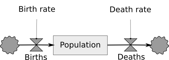 System Dynamics model visualized manually with Inkscape
As you can see, in many ways it worked, but there are areas that it could be better. One problem is that I cannot control the placement of the arrowheads, and with some types of arrows they were overlapping the shapes too much. You can download the simple example here (coming soon).
Another major limitation was that Inkscape would not allow me to connect the Population variable with the flow variables a second time, to indicate feedback to the number of births and deaths (these depend on the population). In other words, the above model is incomplete. Of course, I could draw some lines manually, without using connectors, but I would lose their functionality and the attached benefits.
Graphviz
OK, so perhaps some existing code can be used to parse a list of relationships and produce acceptable output. Graphviz is one such option, and I will try it out next.
Until next time….